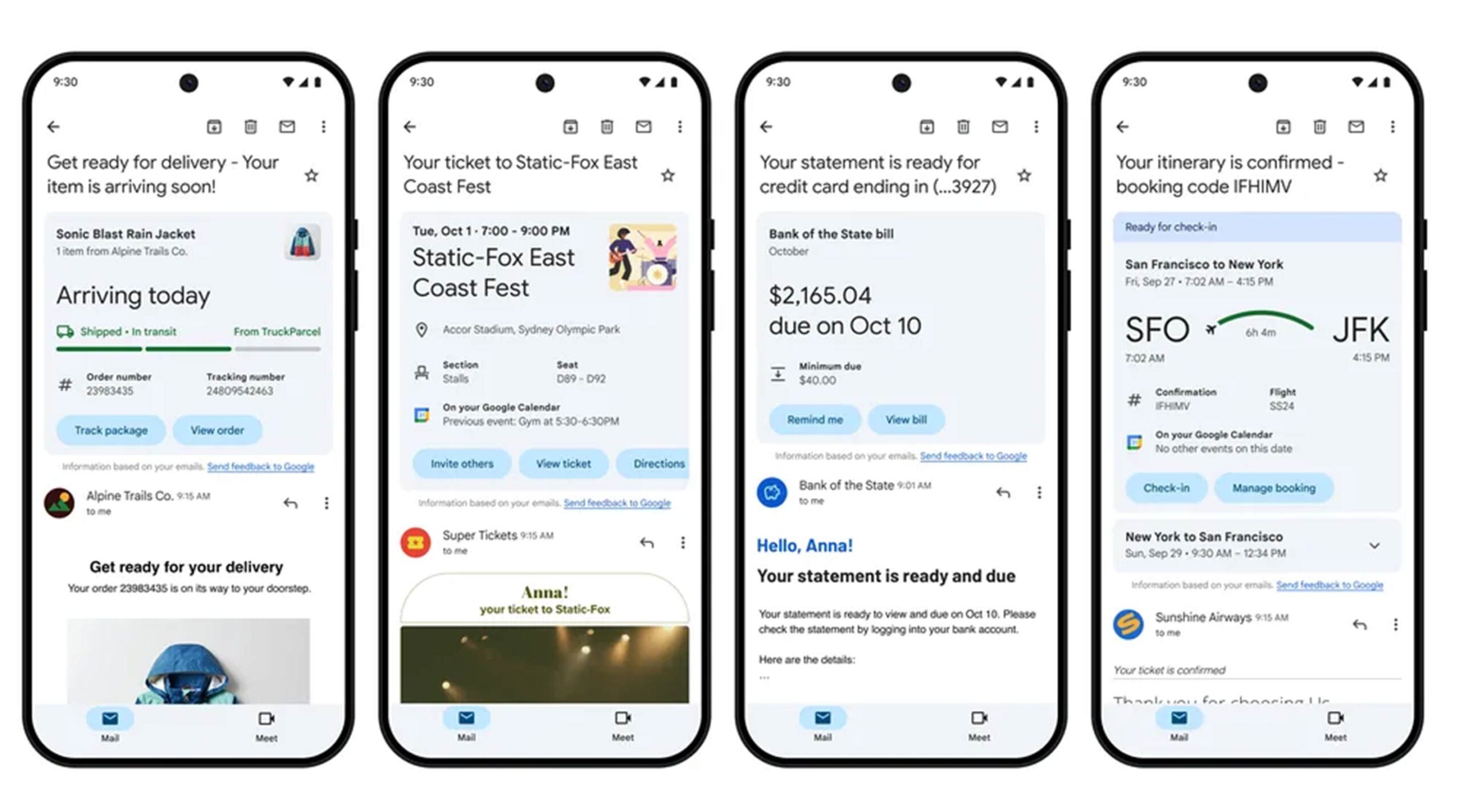
Gmail's Summary Card Gets a Fresh New Design: What You Need to Know
What are Summary Cards?
Summary cards in Gmail provide users with a quick overview of email content without needing to open each message. They summarize essential information, like event details, flight itineraries, or order confirmations, directly in your inbox. This feature helps streamline email management, making it easier to find and respond to important messages at a glance.
The New Design: Key Features
Enhanced Visual Appeal: The updated summary cards boast a cleaner, more modern design. With a focus on aesthetics, the new look incorporates larger images and clearer typography, making information easier to read and navigate.
Improved Layout: The redesign organizes information in a more intuitive manner. Key details are highlighted, allowing users to quickly grasp essential information without sifting through text-heavy emails.
Consistent Branding: The new design aligns with Google’s Material Design principles, ensuring consistency across its suite of products. This unified look enhances the overall user experience, creating a more cohesive interaction within the Gmail environment.
Interactive Elements: The updated summary cards include interactive buttons for common actions, such as RSVPing to events or tracking orders. This functionality allows users to respond directly from their inbox, saving time and effort.
Personalization: The summary cards are now more tailored to individual user preferences. Gmail learns from your interactions, displaying information that’s most relevant to you, which enhances productivity and user satisfaction.
Benefits of the New Design
Efficiency: With a more organized layout and highlighted information, users can quickly locate the emails that matter most. This efficiency is particularly beneficial for those with busy schedules or high email volumes.
Enhanced User Experience: The visually appealing design makes navigating your inbox a more pleasant experience. A well-organized inbox can significantly reduce stress and improve productivity.
Seamless Integration: As part of Google’s broader ecosystem, the new summary cards integrate smoothly with other Google services, making it easier to manage tasks, events, and communications all in one place.
How to Make the Most of Summary Cards
Keep Your Inbox Organized: Take advantage of Gmail’s sorting and labeling features to ensure that important emails and summary cards are easily accessible.
Engage with Interactive Features: Make sure to use the new interactive buttons for quick actions, such as RSVPs or order tracking, to save time.
Stay Updated: Keep an eye on Gmail updates and features, as Google frequently rolls out improvements to enhance user experience.
The new design of Gmail’s summary cards marks a significant step forward in improving email management. With its enhanced visual appeal, improved layout, and interactive elements, users can enjoy a more efficient and enjoyable email experience. As we embrace these updates, it's clear that Google remains committed to refining its tools to better serve users in an ever-evolving digital landscape. Whether you’re managing work emails or personal communications, the revamped summary cards are set to make your inbox a more organized and user-friendly space.